
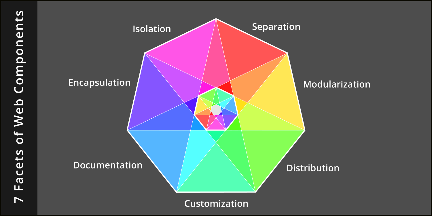
The 7 Facets of Web Components
Encapsulation, isolation, separation, modularization, distribution, customization & documentation
 by Joe Honton
With components, the first thing to come to terms with, is that they are not primarily a design concern. That is, they are not a technology solution to a user problem.
So thinking about UI/UX first is a distraction. Rather, they're a software developer concern, providing a solution to problems faced by software developers.
There are seven distinct facets to well-designed components, which are independent of any framework (React, Vue, Angular) and adhere strictly to W3C web standards:
- Encapsulating custom HTML elements, so that they can be treated as a unit.
- Isolating CSS rules, to guard against specificity leakages.
- Separating the work of templating, decorating, and controlling into the web's three core languages.
- Modularizing the component parts to provide internal scoping.
- Distributing the finished product so that it can be shared with others.
- Customizing the published product to work in different settings.
- Documenting how all the pieces fit together.
Encapsulation
One of the easiest concepts to grasp with web components is the idea that pieces of a document are carved out of the whole and treated as a unit. This is done using custom elements, a W3C technology.
The spec for custom elements describes its life-cycle, from the moment the browser adds it to a document, to the moment it's removed. Life-cycle events sent by the browser to the custom element can be intercepted and used for construction, reaction and destruction.
The scoping that this provides means that the developer can declutter their document-level onLoad and onUnload callbacks. Furthermore, changes to the custom element's attributes can be reacted to in a similar fashion. This allows for localizing all event listeners, placing them together with the rest of the component's code.
Defining a custom element is a simple one-liner:
customElements.define('my-component', MyCustomComponent);
Here the first argument is the custom element name and the second argument is the JavaScript class that defines the component's behavior. With that statement, the custom element name is now on an equal footing with HTML's predefined tags and can be used just like any other element.
<body>
    <h1>Hello World!</h1>
    <my-component></my-component>
</body>
The inner workings of the new component are encapsulated in this one tag.
Isolation
For several years I ignored the component revolution, not fully appreciating the shadow DOM specification published by the W3C. Perhaps it was the unfamiliar name, with its "once removed" connotation. I now recognize it as a scoping technology, and give it full credit for providing a solution to one of my most aggravating problems: CSS specificity rules.
In the past, I lamented the fact that no amount of clever naming could help me to write CSS that targeted elements properly. I explored this problem in detail in Why the Hardest Part of CSS Is Specificity.
At the time, it seemed that every new CSS rule I declared would have some unintended side effect on elements that were totally unrelated. Even when I fully grasped the concept of specificity, I still found it hard to craft solutions that didn't have side effects. For me, the ability to engineer unbreakable CSS solutions just wasn't happening.
This is where shadow DOM fits it. It provides a firewall between elements scoped to the document, and elements defined within a custom element. The benefit is both safety and simplicity.
For example, if I declare special rules in my component for how hyperlinks are displayed, those rules won't leak out and override the hyperlinks outside the component. Styling rules can be declared directly on the element type with something as simple as:
a {
    color: blue;
    text-decoration: none;
    border-bottom: 1px dotted blue;
}
a:visited {
    border-bottom: 1px dotted purple;
}
a:hover {
    border-bottom: 1px solid blue;
}
Clean code. I no longer have to target elements within the component using class names or identifiers.
Separation
Web components make use of three distinct languages: HTML for templating the elements, CSS for decorating the elements, and JavaScript for controlling interaction with the user.
Most developers know the benefits accrued from the separation of concerns, so there is no need to repeat them here. Oddly, in recent years, this design principal has been flagrantly ignored. But when adhered to, a simple pattern arises to bring the three languages into harmony.
- The structural markup is written as an HTML
templatewhich is saved to an.htmlfile. - The decorations are declared using CSS rules which are saved to a separate
.cssfile. - The script to control user interaction is written in JavaScript which is saved to its own
.jsfile.
In this pattern, the component's initialization is placed in the .js file and invoked by the browser when the custom element is added to the DOM. Then, the JavaScript code uses HTTP to dynamically fetch the HTML template and CSS rules, adding them to a shadow root:
async connectedCallback() {
    var htmlFragment = await this.fetchTemplate();
    var styleElement = await this.fetchCSS();
    this.attachShadow({mode: 'open'});
    this.shadowRoot.appendChild(htmlFragment);
    this.shadowRoot.appendChild(styleElement);
}
Voilà! The three languages are brought into harmony, and the separation of concerns is kept intact.
Modularization
Defining local namespaces has been a common need that every major programming language has had to grapple with. JavaScript does this with import/export statements. This language feature eliminates global environment pollution. The benefit is that function names can be short and sweet. No more initABC and initXYZ when plain old init will do.
Note that I'm specifically talking about ES modules here, not old-school require statements. When used properly, the component's dynamic parts can appear on demand, being loaded only when needed.
To use this in an HTML document, follow this new pattern being sure to specify the type='module' attribute:
<head>
    <script src='/my-component.js' type='module'></script>
</head>
When done this way, each piece of the component automatically receives the caching and compression benefits afforded by HTTP. This is in contrast to the all-in-one amalgamations that bundlers deliver. For more about this, I explored the diminishing need for bundlers in the new world of ES modules in The Rollout of Modules Is Complete.
Distribution
When the component is complete, it can be published on NPM for use by website applications. NPM is a public package manager initially designed for Node.js libraries, but it also works well for web components. A simple package.json file suffices to describe the component:
{
  "name": "my-component",
  "version": "1.0.0",
  "description": "a W3C standard web component",
  "repository": {
    "type": "git",
    "url": "https://github.com/my-github-user-name/my-component.git"
  },
  "files": [
    "my-component.html",
    "my-component.css",
    "my-component.js"
  ]
}
To install the component, a separate package.json file is created in the website's root directory using the npm init command. The command npm install my-component is used to download the component and place it in the website's node_modules directory. For brevity, the full mechanics of setting up NPM, publishing a package, and installing a package are omitted.
The benefits are: easy publication by the component creator; wider distribution to the JavaScript community; and semantic versioning for the component consumer.
Customization
Most components will provide default styling that meets the needs of the original creators. This is rarely what component consumers want. Component developers can accommodate those consumers by anticipating which CSS declarations are likely to be objectionable, and changing the declarations to pull values from CSS variables.
The most common types of customizations will be related to color schemes, component positioning, and component sizing. Judicious use of generically named variables works best. Remember, because shadow DOM isolates the elements, there is no need to create prefixed names like --my-component-width. A simple name like --width will work.
Variable names should be declared with default values, inside the component's CSS file, in a :host selector, then applied to the component using var() syntax, like this:
:host {
    --color: white;
    --background-color: black;
    --width: 70vw;
    --height: 50vh;
}

#component {
    color: var(--color);
    background-color: var(--background-color);
    width: var(--width);
    height: var(--height);
}
When done like this, the consumer can override these defaults by simply targeting the custom-element name in the application's CSS and defining new variable values:
my-component {
    --color: midnightblue;
    --background-color: mintcreme;
    --width: 700px;
    --height: 500px;
}
Consumers benefit by not having to fork the repo just to make stylistic changes.
Documentation
Consumers must be provided with sufficient instructions, examples, and reference materials to use the component as intended. The published readme file should have these sections:
- Motivation. A statement of what problem the component solves.
- Features. A description of how the component solves that problem.
- Installation. A link to where to get the component, and where to put it.
- Configuration. A description of how to use each attribute exposed to the consumer.
- Example. A
Hello Worldwalk-through showing how to get the component working on an HTML page. - Customization. A list of all the CSS variables that can be overridden.
- Events. A list of the events emitted or consumed by the component and their place in the life-cycle.
The first two items in this list are descriptive: they're the selling points. The next three are tutorial in nature: a step-by-step guide for dummies. The final two are reference material so that the consumer doesn't have to read the code to figure out what's going on.
For brevity, the above code samples have necessarily been incomplete. For the interested reader, you can see all seven facets in action in these open source W3C compliant web components.
When developing any piece of software beyond the simplest of Hello World! apps, the developer must find ways to keep unrelated code from interfering with the task at hand.
This has been the catalyst for many of the fundamental coding strategies we've created for ourselves, that is: functions, objects, modules, local variables, and other such scoping patterns.
Web components fit squarely within this realm.


