
Add Flexibility to Web Components with Slots
Shift the emphasis from component developer to component consumer
 by Joe Honton
Custom elements and templates
A custom element is a standards-based technology that allows a software developer to extend HTML's basic set of tags. It is used together with other standards-based technologies to create a web component which is independent of any proprietary framework such as React, Vue or Angular.
Everything here is future-proofed, designed and approved by the World Wide Web Consortium (W3C).
As a starting point, consider a document that has a structure such as this:
<body>
    <h1>Hello World!</h1>
    <my-component></my-component>
</body>
In order to legitimize this, the developer must inform the browser about the new tag name, and tell it what JavaScript class is going to define its behavior. That's done with a statement like this:
<script>
    window.customElements.define('my-component', MyComponent);
</script>
The new my-component tag becomes shorthand for a hierarchy of elements that the component developer specifies. Initially that hierarchy is inaccessible to the document DOM — it's wrapped in an HTML <template> and kept on the sidelines, until needed by the browser.
For discussion purposes, I'll declare a template that could be used with a web component that mimics a dialog box with caption, inner content and footer.
<template>
    <caption>Getting Started</caption>
    <section>
        <h2>Welcome</h2>
        <p>Press OK when you're ready to begin.</p>
        <button>OK</button>
    </section>
    <footer>Glad you're here!</footer>
</template>
The slot element
Let's not get bogged down in the details of what the MyComponent JavaScript class does, or how the web component life cycle works. We'll leave that discussion for elsewhere, see The 7 Facets of Well-Designed Web Components.
Instead, let's concentrate on the template we've created, changing it to make the heading and text generic. The objective is to let the consumer, the application developer who uses the component, decide what to put in there. This is where the <slot> tag come into play. Here's the same template but with a slot, ready to accept elements from the consumer:
<template>
    <caption>Getting Started</caption>
    <section>
        <slot></slot>
        <button>OK</button>
    </section>
    <footer>Glad you're here!</footer>
</template>
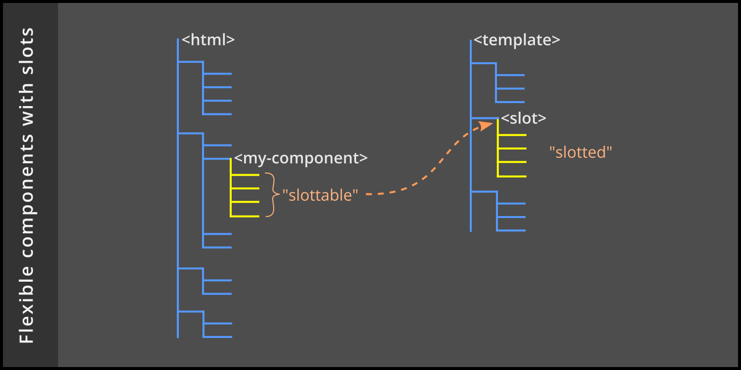
Slottable and slotted
To use this new component, the consumer adds elements in between the opening and closing custom element tag name, like this:
<body>
    <h1>Hello World!</h1>
    <my-component>
        <h2>добро пожаловать</h2>
        <p>Нажмите OK, когда будете готовы начать.</p>
    </my-component>
</body>
The h2 and p elements specified by the consumer in this example are referred to as slottable elements.
When the browser renders the document, it composes the template and the slottable elements into an internal hierarchy that looks like this:
<body>
    <h1>Hello World!</h1>
    <my-component>
        <caption>Getting Started</caption>
        <section>
            <h2>добро пожаловать</h2>
            <p>Нажмите OK, когда будете готовы начать.</p>
            <button>OK</button>
        </section>
        <footer>Glad you're here!</footer>
    </my-component>
</body>
In the composed hierarchy, the heading and paragraph obtained from the consumer are said to be slotted elements.
Named slots
As we can see, the component is now a hodge-podge of English and Russian. To clear this up, we'll want to allow the consumer to specify the caption and footer too. This is where named slots comes into play. The component developer should change the template to have three slots, each with a unique name attribute (title, inner, and message).
<template>
    <slot name='title'></slot>
    <section>
        <slot name='inner'></slot>
        <button>OK</button>
    </section>
    <slot name='message'></slot>
</template>
Here's how the consumer should markup the document with named slots to properly use all three:
<body>
    <h1>Привет, мир!</h1>
    <my-component>
        <caption slot='title'>Начиная</caption>
        <h2 slot='inner'>добро пожаловать</h2>
        <p slot='inner'>Нажмите OK, когда будете готовы начать.</p>
        <footer slot='message'>Рад, что ты здесь!</footer>
    </my-component>
</body>
The browser composes the document hierarchy to become:
<body>
    <h1>Привет, мир!</h1>
    <my-component>
        <caption>Начиная</caption>
        <section>
            <h2>добро пожаловать</h2>
            <p>Нажмите OK, когда будете готовы начать.</p>
            <button>OK</button>
        </section>
        <footer>Рад, что ты здесь!</footer>
    </my-component>
</body>
Default slot values
The component developer could have provided default values for each of the three slots so that consumers aren't forced to provide them. These defaults would be overridden when the document is composed, but only if the consumer has provided slottable elements with matching names. Here is the version with defaults:
<template>
    <slot name='title'>
        <caption>Getting Started</caption>
    </slot>
    <section>
        <slot name='inner'>
            <h2>Welcome</h2>
            <p>Press OK when you're ready to begin.</p>
        </slot>
        <button>OK</button>
    </section>
    <slot name='message'>
        <footer>Glad you're here!</footer>
    </slot>
</template>
If the consumer provided the Russian language document markup shown previously, then the composed hierarchy would be exactly as we've already seen. But if the consumer omitted the named slots, the composed hierarchy would look identical to the very first template that we began with.
We've just made our web component flexible!


